Flowx: Weather Map Forecast
- 4.2
- Rating
- 500.00K
- Installs
- Free
- Price
 Analysis by App-foxy
I started using Flowx: Weather Map Forecast because ordinary weather apps often make me jump between hourly cards, radar screens, and separate pages for sunrise or moon information. Flowx takes a different approach: it puts the forecast on an animated map and lets me move through time visually. That makes it feel less like reading a daily bulletin and more like watching a weather system develop.
As a weather app from Flowx Weather App, it is aimed at people who want more context than a simple temperature and rain icon. The app is free to download, suitable for Everyone, and available on Android devices running version 8.0 or later. Its current version is 4.146, and the project has been around since December 21, 2012. That long presence shows in the way the app focuses on forecast exploration rather than trying to imitate a general-purpose news or lifestyle application.
My overall impression is positive, but with an important qualification: this is not the easiest weather app for someone who only wants to know whether to carry an umbrella. It rewards curiosity and repeated use. Once I understood the map, timeline, layers, and forecast-model choices, I could answer more practical questions, such as whether rain was moving toward me, whether wind would change during a trip, and how much confidence I should place in a longer-range outlook.
You May Also Like

 Blood Strike: 2.5 Anniversary
Blood Strike’s Loadouts Turn Every Drop Into a Tactical Gamble
A close look at Blood Strike’s custom loadouts: how fast access to signature weapons reshapes its battle royale rhythm, rewards preparation, and narrows the gap between fights.

 Pandora - Music & Podcasts
Pandora’s Music Is Easy to Start, but Harder to Recover
Pandora’s strength is its low-effort path from a seed to a station. Its weak spot is how much confidence it asks you to place in connection, setup, and quiet recovery.

 8 Ball Pool
 Is Built on Rivalries, Rematches, and Routine
A close look at the rivalries, rematches, shared routines, and unanswered safety questions that turn a quick pool match into a persistent mobile community.

 Samsung Music
’s Quiet Strength Is Playing What You Already Own
Its reach comes less from spectacle than from dependable access to a personal library. That simplicity is both the app’s strongest retention engine and its ceiling.

 AccuWeather: Weather Radar
AccuWeather Review: A Quick, Clear Forecast for Everyday Decisions
For everyday plans, the best forecast is the one you can understand quickly. AccuWeather makes rain timing, radar, and local conditions easy to act on, with a few trade-offs.

 Hill Climb Racing
Why Hill Climb Racing Still Turns Crashes Into One More Run
A tiny car, a bumpy hill and one more upgrade: Hill Climb Racing keeps resurfacing because its simple chaos makes every near-miss feel personal.
More From Our News Desk



How I use the map for an everyday forecast
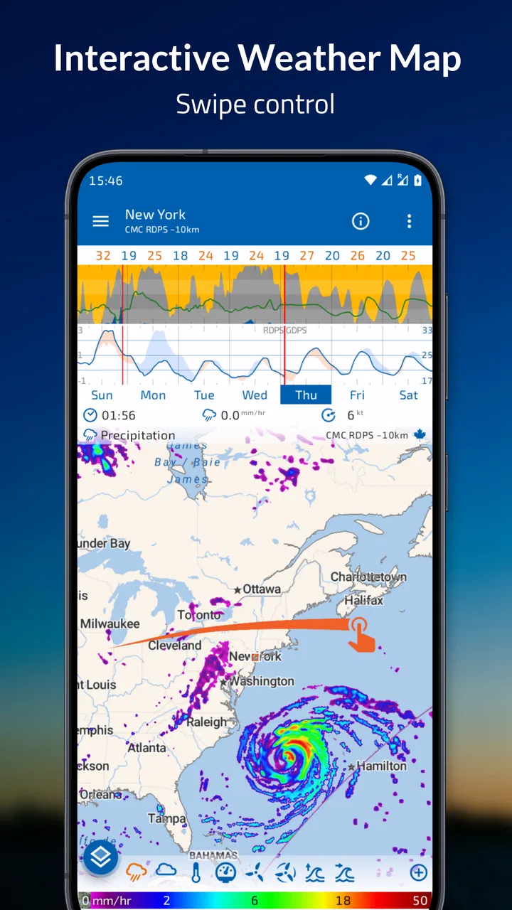
The most useful starting point is to treat the map as a timeline rather than a static picture. I choose my location, look at the current conditions, and then move forward through the forecast to see how the pattern changes. The animation is especially helpful when a front or band of rain is approaching. Instead of seeing isolated hourly predictions, I can follow the movement across the surrounding area.
A realistic example is planning a morning commute followed by an outdoor appointment. A conventional forecast might show rain icons at two separate hours, but it may not make the timing feel clear. In Flowx, I can advance through the map and watch whether the precipitation area arrives before I leave, passes during the journey, or develops later. That does not remove uncertainty, but it gives me a better mental picture of what the forecast is actually saying.
I also find the map useful when the forecast is borderline. If the rain area is small and moving away, I may make a different decision than when a broad system is steadily approaching. The value is not simply seeing more colors; it is connecting my location with the weather around it. That regional view is one of the clearest reasons to choose this app over a basic forecast screen.
The time controls take a little practice. At first, I wanted to swipe around as quickly as I would in a standard hourly list, but the map works better when I move deliberately. I check the current position, advance in larger steps to understand the general trend, and then return to the period that matters. This repeatable habit prevents me from getting lost in the animation and keeps the app focused on a decision.
The app also brings together multiple forecast models, radar, sun and moon information, and hurricane tracks. I do not use every layer every day, but having them in the same weather workspace is valuable when conditions are changing or when I am planning beyond the next few hours. The key is to avoid turning on everything at once. A crowded map can look impressive while making the actual answer harder to find.
For a quick glance, the map may feel slower than a compact widget or a notification. For understanding movement, it is much stronger. I would describe Flowx as a visual forecasting tool first and a convenience app second. That distinction matters before you decide whether it suits your routine.
Building a dependable daily routine
My preferred routine begins with the local forecast and then expands outward only when there is a reason. I first check the map around my location, then inspect the timeline for the part of the day I care about. If the weather looks unsettled, I compare another forecast model rather than immediately trusting the first result. This gives me a simple baseline without turning every morning into a research project.
Comparing models is one of the app’s more meaningful strengths, but it also creates responsibility. Different models can disagree, especially farther into the future or around rapidly changing systems. I do not interpret disagreement as proof that one model is wrong. Instead, I treat it as a signal to be cautious. If the models broadly agree, I feel more comfortable making a firm plan. If they diverge, I leave extra flexibility.
This is a practical advantage over many usual weather alternatives, which often present one polished forecast without showing how variable the underlying outlook may be. A single number can look precise even when the situation is not. Flowx makes the uncertainty more visible, although users still need to interpret it sensibly.
Radar is most useful to me for near-term decisions, while the model layers help with broader planning. I avoid using a long-range model view as if it were a minute-by-minute radar. The distinction sounds obvious, but it is easy to forget when all the information appears on one screen. My rule is simple: use radar to understand what is already happening nearby, and use forecast models to explore what may happen next.
The sun and moon information is another example of a feature that becomes useful when tied to a specific plan. I might check daylight before a walk or consider moon conditions when planning an evening activity. It is not the reason I would install the app, but it saves me from opening another tool when I need that context alongside the weather.
Settings that deserve attention
The first setting worth checking is the forecast model. Leaving the default choice untouched is perfectly reasonable for casual use, but experienced users will get more from the app by learning when to compare alternatives. I do not switch models constantly. I choose one for my normal routine, then compare it when a forecast seems uncertain or when the consequences of bad timing are higher.
Map layers also deserve a deliberate setup. I prefer a clean baseline view for everyday checks and add radar or other information only when it answers a particular question. This makes the app faster to read and reduces the temptation to interpret decorative detail as certainty. The best configuration is not the one with the most information; it is the one that lets me make a decision quickly.
It is worth spending time learning the visual language of the map. Colors and motion carry much of the meaning, so a new user may initially wonder whether a change represents intensity, direction, or simply the passage of time. I recommend exploring the map when the weather is calm rather than waiting for a stressful travel day. That small preparation makes the app far more approachable.
Location handling is another practical consideration. I use a saved or familiar location when I want a consistent routine, then move to a different area when planning travel. The important habit is checking which place is currently active before interpreting the map. A beautifully detailed forecast is not useful if it is centered on the wrong destination.
The app includes optional purchases priced from $1.99 to $19.99 per item. I would begin with the free experience and decide whether the additional capabilities match my needs before paying. Someone who only checks tomorrow’s rain may never need to spend anything. Someone who regularly compares models, studies weather systems, or uses the app for outdoor planning may find the expanded experience more worthwhile.
I also appreciate that the age rating is Everyone, but that does not mean the interface is equally effortless for every user. The content is broadly suitable, while the map-based design still asks for some patience. A child can look at the animation, but an adult who wants reliable planning should learn what each layer represents instead of treating the display as a simple forecast icon.
Shortcuts and repeatable patterns that save time
The fastest workflow I found is based on a fixed sequence: open the map, check the current time, move forward to the period that matters, and only then add a layer or compare a model. This is quicker than opening every available view. It also makes my decisions more consistent because I am asking the same questions each time.
For a commute, I focus on precipitation movement and timing. For a walk, I pay more attention to the general pattern and wind conditions shown by the selected forecast information. For travel planning, I compare the wider regional picture and look for disagreement between models. These are not separate modes that the app forces me to use; they are habits I built around its visual design.
One non-obvious benefit is that the map helps me notice weather that is not directly over my location yet. In a list-based app, I might see a dry current hour and assume the day is safe. Flowx encourages me to look around the location and ahead in time, which can reveal an approaching system before it becomes an immediate problem.
Another useful habit is taking a broad look before zooming into details. I first ask what the whole region is doing, then inspect my local area. This prevents a narrow view from hiding the larger movement of rain or wind. It is particularly helpful when planning a drive across several areas rather than staying near home.
I would not keep the animation running continuously. It is more useful as an intentional comparison tool than as background entertainment. I move through the forecast, pause when the relevant period appears, and then return to the local point. That approach saves battery attention, reduces visual overload, and makes the information easier to explain to someone else.
The same method works for hurricane tracks. I would not use a track display as a substitute for official emergency guidance, but it can help me understand the projected path and how it relates to a wider region. In a serious weather event, I would use Flowx for context and official local instructions for decisions about safety, evacuation, or shelter.
Where the experience becomes demanding
The biggest limitation is the learning curve. Many weather apps are designed around a large temperature number, a short summary, and a row of icons. Flowx asks me to read a moving map and understand several kinds of information at once. That is more powerful, but it is not automatically more convenient.
The app can also encourage false confidence if I mistake visual detail for accuracy. A smooth animation may look authoritative even when forecast models disagree. I have to remember that a precise-looking map is still a forecast. The right response to uncertainty is not to zoom in further; it is to compare the outlook, consider the timing, and keep a backup plan.
Multiple models are helpful, yet they can make the decision harder for people who want one clear answer. When the models conflict, Flowx does not magically turn that conflict into certainty. I see this as an honest limitation of weather forecasting rather than a defect unique to the app, but users should know what they are signing up for.
The map-first design is also less suitable for accessibility preferences centered on plain text or extremely simple visual summaries. Someone who has difficulty distinguishing colors, interpreting moving graphics, or navigating dense map information may prefer a weather service with stronger emphasis on spoken or text-based explanations. Flowx is best for users comfortable learning a visual interface.
It is not the right choice if your main requirement is a tiny, instant glance from a widget, a highly simplified daily forecast, or a constant stream of local alerts. The app’s strengths appear when I actively explore weather. If I only want to know the temperature before leaving home, a simpler alternative may be faster.
There is also a practical trade-off in the free-versus-paid structure. The free download makes it easy to test the core approach, but users who want the broadest set of tools should review the available purchases inside the app. I would not pay simply because the interface looks advanced. I would pay only if the extra capabilities become part of a real planning habit.
Who will get the most from it
Flowx is a strong fit for hikers, cyclists, travelers, photographers, gardeners, and anyone whose plans depend on how weather moves rather than on a single daily symbol. It is also useful for people who enjoy comparing forecast models and want to understand why a prediction may change from one update to the next.
I can see it being especially valuable for someone who regularly plans outdoor work. A gardener might check whether a rain area is approaching before watering. A cyclist could examine the wider route instead of looking only at the departure point. A photographer might combine weather movement with sun information when deciding whether a planned shoot is worth keeping.
It is less suitable for a person who dislikes maps, wants no setup, or expects the app to explain every forecast in plain conversational language. The app does not replace judgment. It gives me a richer set of visual tools, and I must decide what those tools mean for my particular plan.
The developer, Flowx Weather App, has kept the product focused on forecasting rather than filling it with unrelated lifestyle features. That focus is a strength for serious weather watchers, although it can make the app feel specialized compared with mainstream alternatives that combine news, alerts, widgets, and broad location services.
My verdict after settling into the workflow
After using it as a regular planning tool, I think Flowx: Weather Map Forecast is best understood as a weather map for people who want to see the forecast develop. It gives me more context than a conventional list and makes regional movement easier to understand. The combination of multiple forecast models, radar, sun and moon information, and hurricane tracks gives the app a wider practical range than its compact name suggests.
The public response is encouraging, with an average rating of 4.2 from around 7.7 thousand ratings and more than 500 thousand installs. Those figures suggest that the visual approach has found a substantial audience, while the experience itself explains why: once I learn the controls, the map can answer questions that a row of icons leaves vague.
My recommendation is to install the free version and give yourself time to learn it during ordinary weather. Start with one location, one forecast model, and the basic timeline. Add radar when you need near-term movement, compare models when uncertainty matters, and use the sun, moon, or hurricane information only when it supports a real plan. That progression keeps the app useful instead of overwhelming.
I would recommend it to a friend who enjoys making informed outdoor plans or wants to understand weather systems visually. I would steer a friend toward a simpler alternative if all they want is an instant temperature and rain probability. The real strength of Flowx is not producing one more forecast number; it is helping me see the pattern behind the number.
FAQs for Flowx: Weather Map Forecast
01What features make Flowx: Weather Map Forecast unique compared to other weather apps?
Flowx stands out with its dynamic and interactive weather maps. Users can visualize different weather data layers like precipitation, temperature, and wind patterns. The app offers a swipe-based interface that allows users to scroll through forecasts over multiple days, providing a comprehensive view of weather changes.
02Is Flowx: Weather Map Forecast suitable for both beginners and advanced users?
Yes, Flowx caters to a wide range of users. Beginners will appreciate its intuitive design and straightforward navigation. Advanced users will benefit from its detailed data layers and customization options, which allow for a deeper analysis of weather patterns and trends, making it versatile for various needs.
03Does the app provide accurate weather forecasts?
Flowx uses data from renowned sources like NOAA and ECMWF, ensuring high accuracy in its forecasts. However, as with any weather app, users should be aware that predictions are subject to change due to the dynamic nature of weather. It is advisable to regularly check updates for the most current information.
04Are there any subscription fees or in-app purchases?
Flowx offers a free version with essential features, but for more advanced functionalities such as additional data layers and extended forecast periods, users can opt for a subscription. This premium version enhances the app's capabilities, making it a worthwhile investment for weather enthusiasts and professionals alike.
05How does Flowx ensure user privacy and data security?
Flowx is committed to protecting user privacy by adhering to strict data security protocols. The app collects minimal personal data and primarily focuses on delivering weather information. Users can review the app’s privacy policy to understand how their data is managed and protected, ensuring a secure experience.
Pros
- Intuitive interface simplifies navigation.
- Detailed weather maps with interactive layers.
- Customizable data sources for accuracy.
- Fast loading times ensure smooth experience.
- Offline mode available for remote areas.
Cons
- Limited free features compared to premium.
- No radar animation in free version.
- Initial setup can be time-consuming.
- Lacks social sharing options.
- Occasional minor bugs in updates.

Flowx: Weather Map Forecast
Gallery